

For historical reasons, Georgians get their power from three different types of companies. As the source and cost of our electricity becomes a larger part of the conversation, it is important to understand where we get our power from, who makes the decisions, and what this means for Georgia. Below we provide an overview of the system, include maps of coverage areas, and an overview of some emerging power-grid concerns.
- GA Power, serving mainly the cities, this is the largest operator in the state in terms of customer numbers
- MUNIs, municipal operators who cover smaller cities
- EMCs, Electric Membership Cooperatives, that were formed out of a depression era program to electrify rural areas
The map below shows the territories all three types, GA Power is in green, MUNIs in red, and EMCs in blue.
This map displays the energy provider territories, colored by the type of provider. Zoom in and click on a region of interest to see the name and extent of the provider that normal rate payers must buy their power from.
In the early days of electricity, it was only profitable to build power generation and transmission infrastructure to serve densely populated areas, such as cities. In Georgia, these dense operators became GA Power. Then, smaller cities and municipalities wanted in on the action and voted to form MUNIs that would utilize a mix of taxpayer funds and private rate payers to provide electricity. Finally, the federal government had to intervene in the great depression to get power out to rural customers, as it was never going to be economical for a private company to serve a single rate payer over such a long distance. These rural power providers are the EMCs.
As the state grew, because all these services were private, they began competing for individual rate payers, and mid-century we ended up with situations where a single urban street would have an option for say three different power suppliers, and thus, three sets of power lines. This is a waste of resources and a fire hazard.
In 1973, Georgia passed the Territorial Act, where GA Power, Munis, and EMCs came together and carved up Georgia into territories where within the territory, a single rate payer only has one service option. For example, a resident of Atlanta can only buy their power from GA Power. These territories are outlined in the map above.
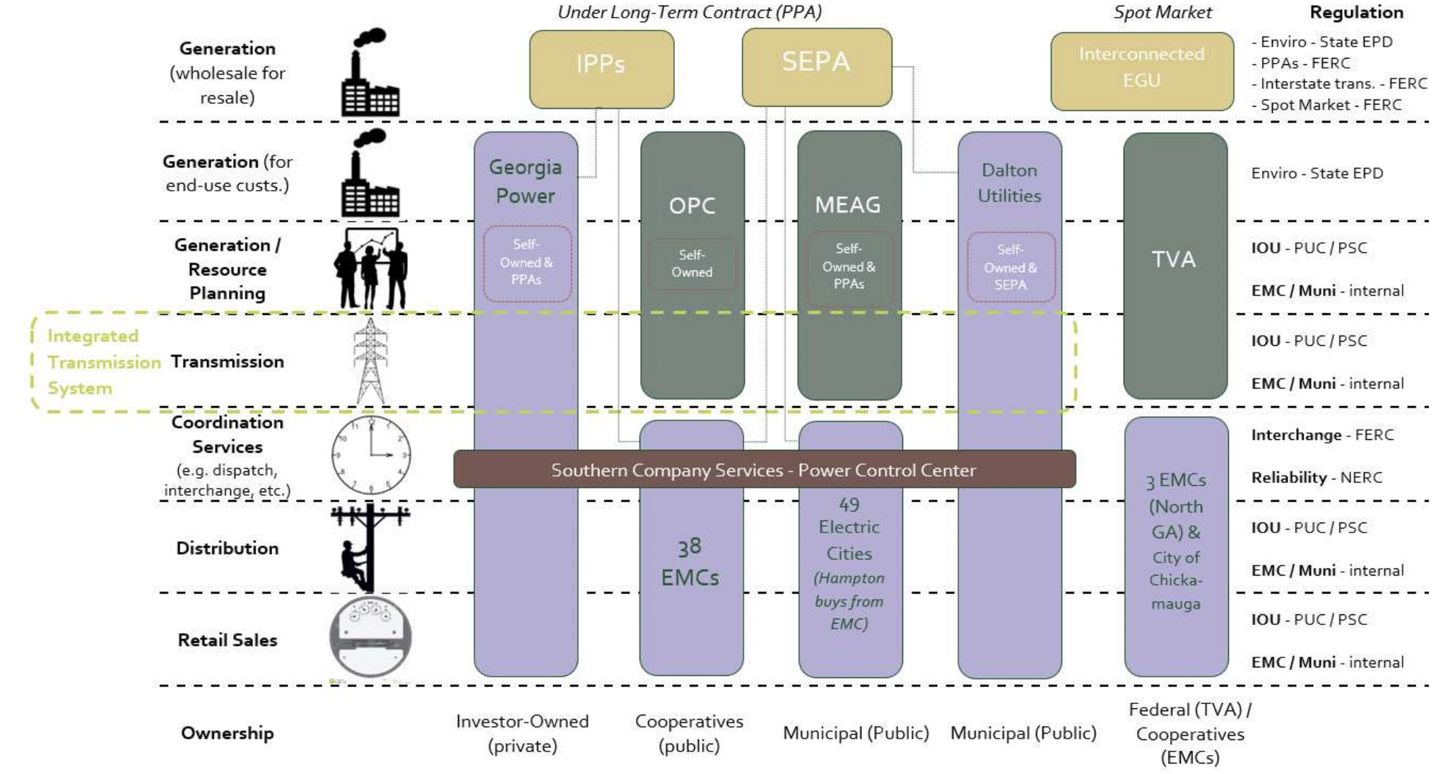
This act set rules for how to solve the disputes and unified transmission infrastructure. Since everyone is sending their power over the same lines, these companies participate in centralized power grid coordination.
The graph below, from Southface, shows how the companies are all interconnected to each other.
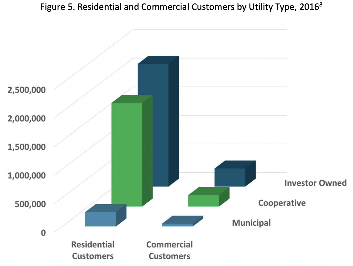
EMCs may cover the largest area of the state, but GA Power has the most coustomers. The below graph, from Southface, shows that a majority of residential customers get their power from GA Power (investor owned), followed second by EMCs (Cooperative), and a small number from MUNIs (Municipal).
What does this mean for consumers?
Citizens of Georgia have no choice about where they buy their power from. To prevent unfair pricing due to lack of choice, the Public Service Commission (PSC) sets rates for GA Power customers (MUNIs and EMCs are supposed to follow suit, but the PSC has no jurisdiction over them). The PSC also plans for how and where GA Power will get their power, including the building of power plants. In theory, the PSC is elected by Georgians, but elections have been on pause for several years due to multiple civil rights lawsuits.
If you live in a MUNI or EMC – there is no such PSC oversight – typically, ratepayers have the power to elect the controlling bodies of these providers.
Are there exceptions?
Yes, if a single facility draws over 900kW (about the size of a modern grocery store), they can choose to contract with any power supplier they choose. They can negotiate their power rate. These rates are often termed “trade secrets” and it is difficult to ascertain how much large facilities pay for the power they consume.
So what's the big deal?
For approximately the past twenty years, power efficiency improvements kept pace with growth. So even while Georgia grew, its overall power demand remained flat. Thus, during PSC planning, they were working on retiring power plants and replacing them with more efficient, cleaner, facilities.
The below map shows electricity generation facilities by type.
This map shows the power sources in the state, colored by the dominant power source.
Unfortunately, in the past few years, industry, including data centers and crypto, mines have been moving into the state at such a high rate, that the projected demand is now much higher than power production. Now, GA Power is asking the PSC to approve building new power plants. New power plants are costly. And their cost is passed onto the rate payer. In the past year, the average electricity bill has risen, on average, $43 a month.
Since large users utilize a negotiated rate that is “hidden” from the public, and since they are creating a majority of the new demand, it is difficult to see if these large demand users are paying their fair share. Or if they are getting a good deal at the cost of individual Georgia households.
In the case of data centers and crypto mines, this is especially unfair, in that both of these facilities do not create jobs for the surrounding communities. Georgians are seeing zero benefits for their increased power bills.
Map of Data Centers and Crypto Mines
The above map shows data centers and crypto mines.
The black icons represent completed data centers, and the orange data centers in progress. A number over the icon represents more than one data center; these will ‘separate out’ as you zoom in on the map using the “+” symbol in the bottom right.
The yellow triangles represent known Crypto Mines – which are not Data Centers – but still energy and water superconsumers.
When you press these icons, a pop up appears with basic information: the data center name, address, county, energy source, absolute location (latitude & latitude), and owner. There is also more detailed information: data center power usage, total power, total square feet, water source, and water usage in gallons. Much of the detailed information is only estimated due to lack of public information about exact values. For example, the power usage is based on the square feet of the given data center, and the water usage is based on power usage. Blanks in the pop ups indicate a lack of enough information to even estimate values. (The trouble with data center energy figures – DCD ).
If you would like to interact with the map – click here or press the expand icon on the map – you can also add and hide layers.
To interact with the map fully, press the “pop-out” icon or click here.
Thank you!
These maps are built, in part, with information from our friends at FindEnergy (energy provider territories) and at FracTracker Alliance (crypto mine locations).